The Ultimate Content Design System: A Guide for Design Enthusiasts
The Content Design System: A Brief Overview
A content design system is a set of guidelines, principles, and reusable UI elements that help designers and developers create consistent, accessible, and engaging user experiences. It comprises various components, including content guidelines, UI design, UX writing, visual consistency, user experience, content strategists, user interface, error messages, content pattern, voice and tone, product management, UX designers, internal consistency, user interface UI design, and more. By implementing a content design system, design teams can maintain a unified look and feel across different platforms, streamline their workflow, and ensure a cohesive user experience.
The Importance of Design Consistency
Design consistency is crucial for creating an intuitive and user-friendly product. A consistent design enables users to recognize and interact with familiar UI elements, reducing cognitive load and making it easier for them to complete tasks. Consistency also fosters trust and credibility, as users are more likely to feel confident in a product that looks and behaves predictably.
Figma: A Powerful Tool for Building Content Design Systems
Figma is a collaborative design tool that enables teams to create, share, and iterate on UI designs in real-time. With its robust component system, Figma makes it easy to build and maintain a content design system that can be used across various projects and platforms. In the following sections, we'll walk you through the process of creating a content design system in Figma, covering key concepts such as UI components, UX patterns, content guidelines, and more.
Building UI Components in Figma
UI components are reusable pieces of UI that can be used throughout a design to maintain consistency and streamline the design process. In Figma, you can create components for various UI elements, such as buttons, forms, menus, and more. These components can be customized, nested, and combined to create complex UI structures while maintaining design consistency.
Principles for Creating UI Components
To ensure a cohesive and consistent content design system, consider the following principles when creating UI components in Figma:
- Reuse UI elements: Turn UI elements into components whenever they are used multiple times across different interfaces.
- Nest components: Components can be nested within one another to create more complex UI structures while maintaining consistency.
- Design for both UI and UX patterns: Components should not only include visual elements but also incorporate consistent interaction patterns and behaviors.
- Use predefined styles: Leverage predefined styles for fonts, colors, icons, and more to maintain visual consistency and streamline the design process.
- Follow a consistent naming structure: Adopt a clear and logical naming convention for components to make it easier to find and use them.
Establishing UX Patterns and Content Guidelines
In addition to creating reusable UI components, a content design system should also define UX patterns and content guidelines that help ensure a consistent user experience. These guidelines may include voice and tone, error messages, content style guides, information architecture, and more.
UX Writing and Voice and Tone
UX writing involves crafting clear, concise, and consistent copy for user interfaces. Establishing a consistent voice and tone for your product helps create a cohesive user experience and strengthens your brand identity. Consider creating a content style guide that outlines the desired voice, tone, and writing conventions for your product.
Error Messages and Content Patterns
Error messages and other types of content patterns should be consistent, informative, and easy to understand. Develop guidelines for crafting error messages and other UI copy to ensure that they provide helpful feedback and guide users towards a successful outcome.
Information Architecture and Interaction Design
A well-structured information architecture and thoughtfully designed interactions are essential for a seamless user experience. When building a content design system, consider how users will navigate through your product, and establish guidelines for creating intuitive and consistent navigation patterns.
Integrating Visual Consistency in Content Design Systems
Visual consistency plays a vital role in creating a cohesive and recognizable user experience. To maintain visual consistency in your content design system, consider the following tips:
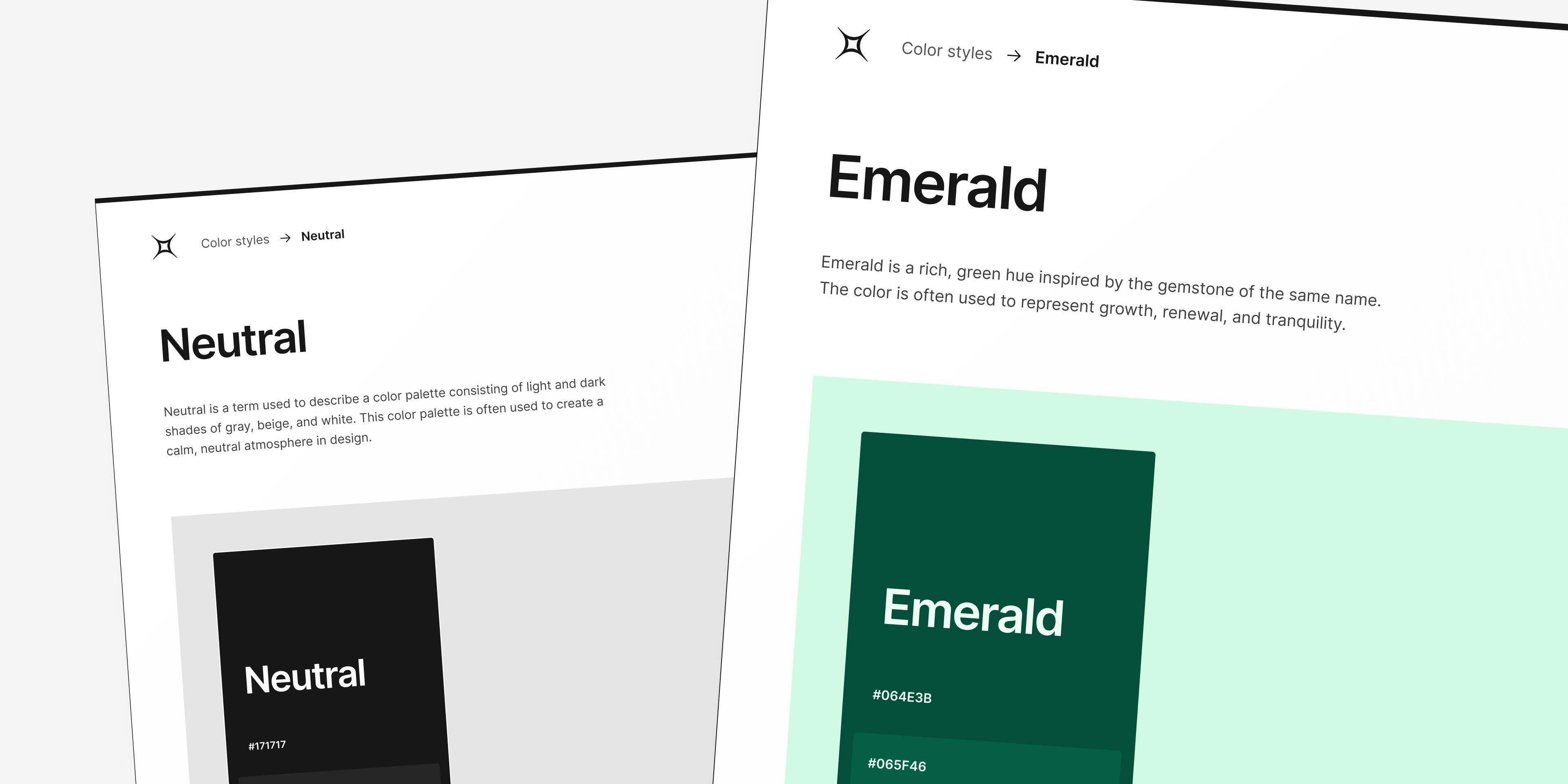
- Use a limited color palette: Stick to a primary color, a secondary color, and a few shades of those colors, plus black and white, to create a harmonious and cohesive look.
- Limit the number of typefaces: Utilize two or three typefaces across your entire product to prevent distractions and maintain a clean, consistent visual design.
- Align UI elements: Aligning UI elements, such as logos, images, headers, and body text, creates a more organized and professional appearance.
Collaboration and Version Control in Figma
Figma's real-time collaboration features allow designers, developers, and content strategists to work together seamlessly on a shared content design system. Designers can easily share components, styles, and other assets, while developers can access up-to-date design specifications and assets for implementation. Additionally, Figma's version control system allows team members to track changes and roll back to previous versions if needed.
Maintaining and Evolving Your Content Design System
A content design system is a living, evolving entity that should adapt to the changing needs of your users and your business. Regularly review and update your content design system to ensure it remains relevant, effective, and consistent.
Continuous Improvement and Adaptation
As your product grows and evolves, your content design system should adapt to accommodate new features, design trends, and user needs. Regularly review your components, UX patterns, content guidelines, and other elements of your content design system to ensure they remain relevant and effective.
Encouraging Creativity and Flexibility
While maintaining consistency is essential, it's crucial to strike a balance between uniformity and creativity. Encourage your design team to explore new ideas and approaches while adhering to the principles and guidelines of your content design system. This will ensure that your product remains fresh, innovative, and engaging while maintaining a consistent user experience.
The Power of Content Design Systems: A Case Study
Let's take a look at how a content design system can transform a product's user experience. Imagine a company that offers a suite of productivity tools for businesses. Initially, each tool was developed separately, leading to inconsistencies in UI design and user experience. Users found it challenging to navigate between the different tools, resulting in frustration and decreased productivity.
By implementing a content design system, the company was able to create a cohesive and consistent user experience across all its tools. Designers and developers could easily access and reuse UI components, ensuring that each tool's interface was visually consistent and intuitive. Users could seamlessly transition between the different tools, boosting productivity and satisfaction.
Key Takeaways for Design Enthusiasts
A content design system is an essential tool for creating consistent, accessible, and engaging user experiences. By leveraging Figma's powerful component system and adhering to design principles and guidelines, you can build a robust and flexible content design system that boosts productivity, fosters collaboration, and delights your users.
Here are some key takeaways to remember:
- A content design system comprises reusable UI components, UX patterns, content guidelines, and more.
- Design consistency is crucial for creating an intuitive and user-friendly product.
- Figma is an excellent tool for building and maintaining a content design system.
- Consider principles such as reusing UI elements, nesting components, designing for both UI and UX patterns, using predefined styles, and following a consistent naming structure.
- Integrate and maintain visual consistency in your content design system through color palettes, typefaces, and alignment.
- Encourage creativity and flexibility within your design team while adhering to the principles and guidelines of your content design system.
- Review and update your content design system regularly to ensure it remains relevant, effective, and consistent.
With these insights and tips, you're well on your way to mastering the art of content design systems and creating memorable, user-friendly products that stand the test of time. So, go forth and conquer the world of design with your newfound knowledge and expertise. Happy designing!